Who?
With 28 Million members and counting, in North America, Europe, and Asia Pacific and 26 offices worldwide, Travelzoo brings the latest and greatest deals from more than 2, 000 travel and entertainments businesses to their members vie email.
Your content goes here. Edit or remove this text inline or in the module Content settings. You can also style every aspect of this content in the module Design settings and even apply custom CSS to this text in the module Advanced settings.
What?
Quite the formidable force, Travelzoo recognised there was still a huge audience out there full of opportunity for increasing membership.
Referrals by satisfied members plays a huge role in the recruitment process and Travelzoo incentivise members to share and recruit new members.
Travelzoo have been running successful referral campaigns, but closed peer networks, over time, return diminishing results. Travelzoo wanted to break free and find new audience so sign up to their exclusive offering.
Why?
Rixxo understands the psychology behind referral signups and identified opportunities to work with Travelzoo to increase the number of shares of a campaign, and also the number of signups.
We recreated an on brand template which was mobile responsive and fast to load. Working closely with the internal marketing team we integrated the campaigns into their email platform and enhanced the app’s sharing tools with Whatsapp and Facebook Messenger.
"I’m pretty sure this is down to the new FB and Whatsapp buttons – users are most probably sharing with all their contacts!"
EMILY HEATH
MARKETING MANAGER, TRAVELZOO UK
Understanding human behaviourMake it easy
Our first step to increasing the conversion rate of these ongoing campaigns through design and interaction was to understand why it was not working as well as hoped.
From our previous work, research and experience we knew 3 key principles about digital competitions:
- People following instructions do 32% better with illustrations
- 38% of users leave if the layout is unattractive
- 68% of users will leave if that can't find something in the first few seconds
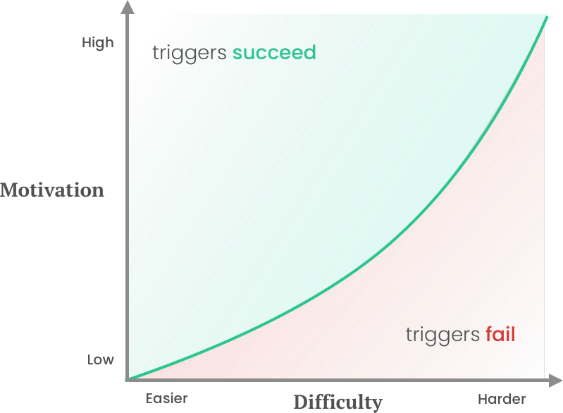
When the competition prize was 5 start luxury trip to Australia more people entered, but when it was a weekend in the UK it dropped.
Why? because the reward for the amount of effort was out of balance.
We couldn't very well give away 5 star luxury holidays every month so the balance had to be shifted elsewhere.

On BrandVisual Enhancements
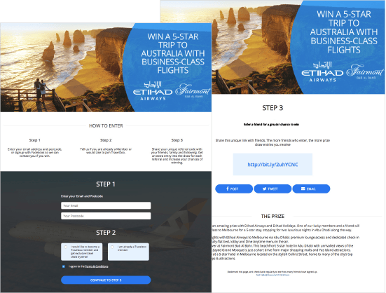
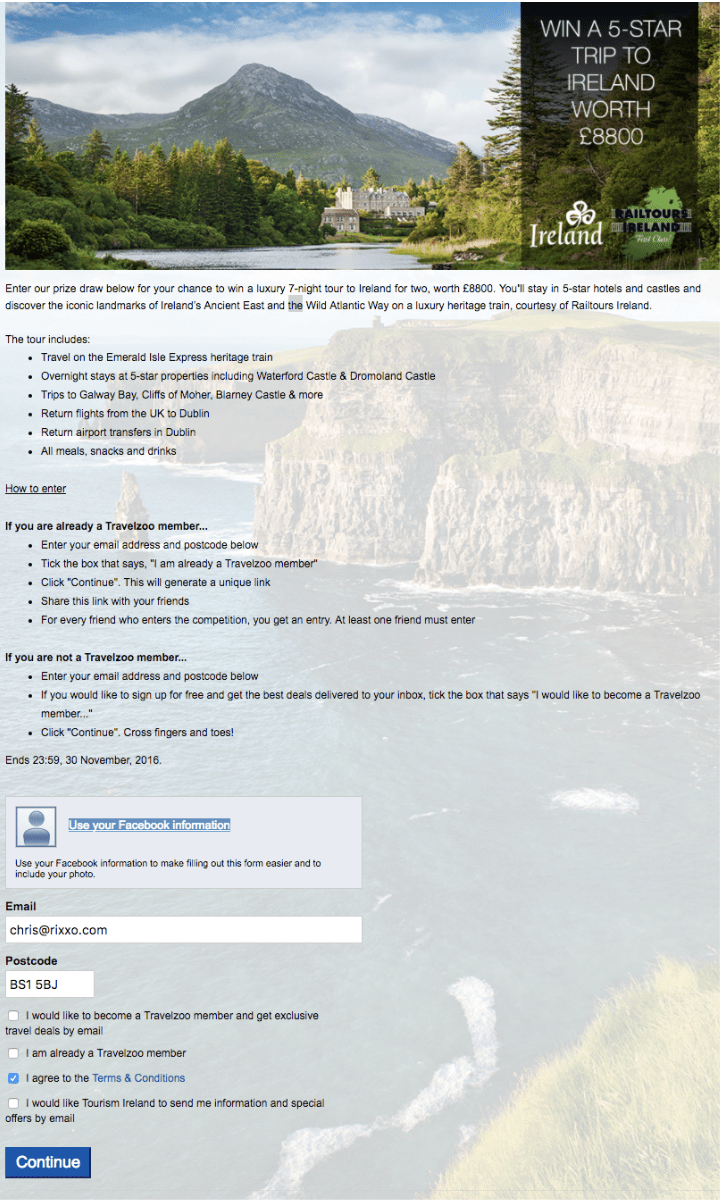
Our first step to creating an improved experience was to bring the campaign quality in-line with Travelzoo brand and messaging policy. When creating shareable campaigns and competitions users want it to look good. It represents them, and their values and the better it looks the better they look.
When using third-party campaign tools and platforms you may find yourself limited. Not here at Rixxo!! We added some custom javascript that allowed us to cleverly adapt the design of the platform to meet Travelzoo brand guidelines and importantly the discerning taste of their users.



Layout:Clear and easy to navigate
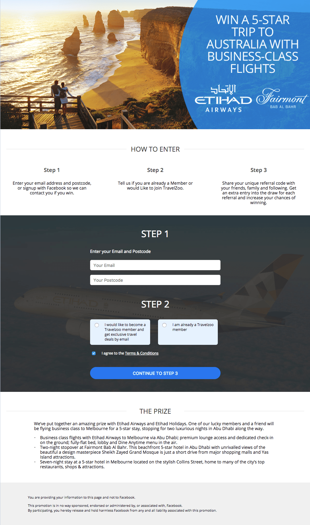
The competition pages we remodelled to include the instructions first. This gave the user an immediate opportunity to assess the amount of effort required to enter.
The steps were clearly set out as a total of 3 and each step clearly labelled for anchoring.
Bringing the brand inline with the website gives the user an immediate sense of authority and builds trust.
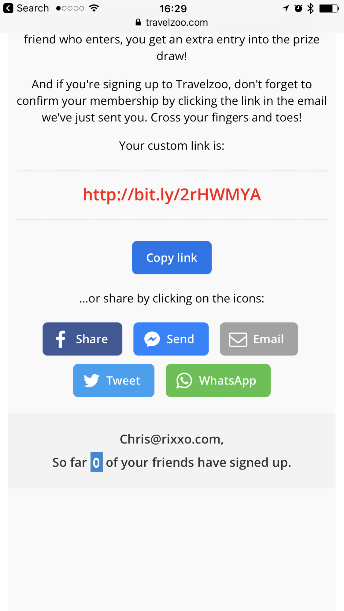

Fig A: Mobile view After redesign
Mobile toolsMessenger sharing buttons
Previous campaign analytics showed very high Facebook usage. We hypothesised that adding Messenger and Whatsapp sharing to the campaign would increase the referral rate.
Why? because it was easy. If you've just entered the competition on your mobile then you are likely to want to share from your mobile.
Whatsapp and Facebook sharing increased referrals for the campaign by 133%
