Pro:voke | Responsive Website Design & Build
Who?
PRO:VOKE® is a leading hair care brand with multinational retail coverage.
PRO:VOKE® have been creating and supplying trusted specialist hair colour products to the UK market for over 30 years since originating from a John Frieda product range.
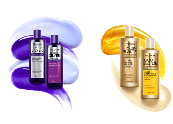
Today, PRO:VOKE® have two leading ranges; Touch of Silver and Liquid Blonde.
Touch Of Silver is an expertly created range specifically for blonde, platinum, white and grey hair.
Liquid Blonde is a range of products specifically designed to meet the needs of those with honey and golden, warm blonde hair who want to enhance their colour and help prolong time between salon visits
What?
PRO:VOKE® wished create a focal point to be the heart of the brand that acts as a hub of information. The website would enable consumers to enhance their knowledge and understanding of the brand and products, and inspire them to have the best hair day that they can have.
Internally PRO:VOKE® required Rixxo to create a solution that requires less time for the team to constantly refresh the content and make it easier for internal marketing team and an elite network of partners to update and showcase what they’re doing.
The old website comprised of two separate sites for each Touch of Silver and Liquid Blonde increasing the workload to update. The statistics also highlighted dead ends and low levels of engagement not befitting of an active, loyal and interested customer base.
Why?
Rixxo first collaborated with the PRO:VOKE® team during our proven research and planning process called Foundations to prepare the project for success.
Taking a “mobile first approach” to design, Rixxo used a process of graceful upscaling to ensure all users we able to enjoy a clean, crisp and user friendly site design. The designs were then implemented creating a backend CMS on WordPress that would allow the PRO:VOKE® team to manage three separate brand sites from one place. Drastically reducing ongoing upkeep and initial costs.
The site was then optimised for search and speed, with the new site ranking within the top 10% of all websites globally for page load speed. Finally, the new site was integrated with leading FMCG SaaS platforms Bazaar Voice and Adimo in line with the brand’s strategy.
Challenge:Two Product Brands
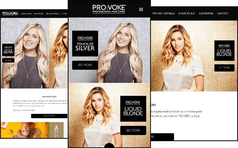
With Touch of Silver and Liquid Blonde, Pro:voke Hair Care were looking for a solution that could help consolidate the two brands and guide users to the product they were looking for.
This meant creating a homepage that proudly displayed and touted both products and gave users a clear direction on where they needed to go. It also acted and was designed in a way to give customers insight into their whole product range.


Mobile FirstDesign
From the beginning we knew that the majority of provoke customers would be browsing the site on a mobile, almost 75%. So it was important that the design process focused on a mobile first mentality throughout. This was not just a design point but a way of thinking about the features, and how they would be incorporated and used on a range of mobile devices.
Of course the site would upscale naturally and elegantly to make sure the customers on larger devices and PCs would have a great experience as well. Focus was on making sure this website achieved a polished look at all resolutions.
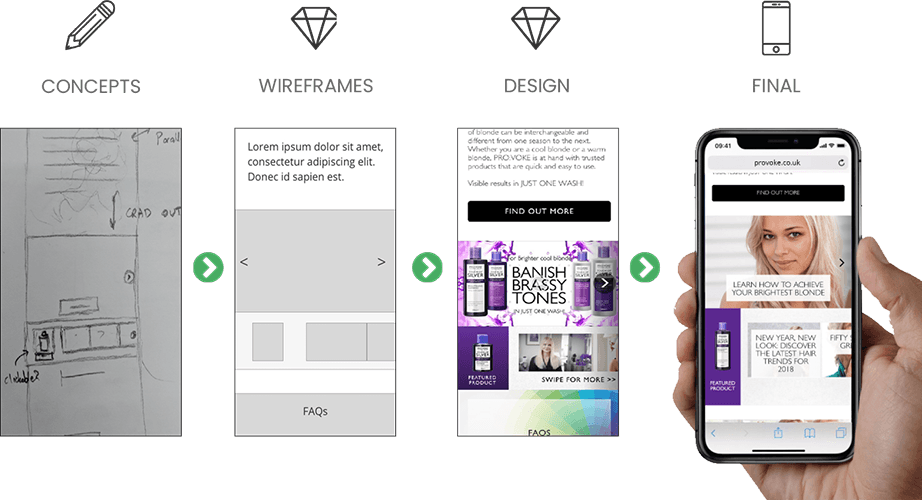
ConceptThe Design Process
A mobile first website, that integrates with reviews, creates engagement and is fast to load.
This is how the design process evolves on a website project like this.


Retain Brand Identity:Three Brands, One Design
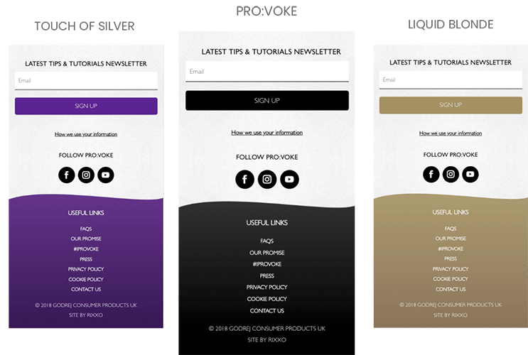
It was important to retain the brand identity of Pro:voke Hair Care, while also differentiating the sites design when a user was on one of the two hair care ranges.
We achieved this with a subtle colour scheme change, that always indicated to the user where they were on the site, while also remaining cohesive to the overall design.
