NetConsulting B2B Lead Generation & CRO
n.b. Background is our "something fancy" as mentioned in this article
Make our website on-brand and easier to use ourselves.
The Challenge
Maintain heritage, update the website to match the new brand and make the content easier to self-service.
The website was built on an easy to use theme builder but was not easy to understand. NetConsulting could not make changes to the website but wanted to create pages of useful content for their existing and future clients.
With a new ambitious marketing manager and plans for growth, it was essential that NetConsulting could move quickly without incurring high development costs.
Our Approach
We began with a full audit of the website. We created a list of quick wins, opportunities for easy changes and proposed some content and marketing changes.
The website was then transferred from the previous agency to Rixxo.
Rather than rebuild we re-worked some of the existing content into an easier to use atomic model. We applied our carefully curated suite of extensions and settings that offer SEO, Speed and Marketing advantage.
- Create Service Page Structure then create Templates
- Create Sector Page Structure then create Templates
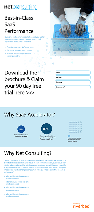
- Create Landing Pages from Wireframes
- Improve navigation and user journeys
- Do something fancy
To complete the work we turned our attention to Search Console and Analytics to ensure our efforts could be tracked and measured.


Fig B: Responsive Mobile Site


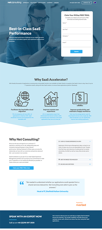
Fig A: Clear easy to use Call-to Actions


Fig C: Peer recommendations through testimonials
Mobile Friendly Templates:Built to climb rankings
It is no secret that Google is measuring the quality of your B2B website on its mobile performance. Yet, if you look at your Google Analytics you will almost certainly have a strong lean of users towards desktop devices.
This is not uncommon in the B2B world so careful consideration was taken to ensure the site performed on Mobile, was detected as mobile responsive and was easy to update. All whilst keeping the bulk of attention and budget on desktop devices where almost 100% of lead conversions were appearing.
When creating the Service Pages and Sector Pages we considered what content was going in and how best to structure this. We worked with NetConsulting to plan additional content such as Case Studies and Whitepapers to fill the "top of funnel" requirement of a content strategy.


Landing Page Templates:Empowering a marketing team
When inheriting a website there is often a "rebuild" attitude. It isn't always necessary to rebuild a website just to update the look. For this project, we simply re-imagined the Beaver Builder theme using the new brand guidelines provided by NetConsulting.
We followed an atomic design approach creating and saving modules that could be reused anywhere in the website.
Creating on-brand, responsive landing pages was as easy as combining modules into the right order and saving them as a template that could be used over and over again.
Neuro-marketing tactics came back into play with the landing pages. See how the face of the sales consultant is focused on the enquiry form drawing the users eye?
Improved Navigation:Drawing the eye
Eye gaze of a person in an image is one way of drawing the users attention to a specific part of the page. This is a common neuro-marketing technique.
Another is animation. Using the direction and speed of animations we can hope to influence the user and the direction of their journey through the site.
The video background on the Digital Experience Management page shows the real working software.
As the Self Service, Manage Service and Atternity tiles scroll into view they do so with a delay on each tile appearing as 1 then 2 then 3. This is it to distinguish them as separate items "advising" the user to choose.
As the Fully Managed Benefits section scrolls in to view the "Book a Free Consultation" button is delayed just slightly to draw the eye onto it and encourage the enquiry.
The final "download" call to action at the bottom of the page does not fade down or left to right. Instead, it appears in its position to emphasise the stop. At this point in the page we are at our last chance to get action from the user.
Another option here would be to set the animation direction upwards. This could encourage the user to head back up the page and revisit some content. The hard stop felt more relevant in this situation.
Funnel Navigation:Improved conversion
Consider the Homepage of your website to be a roundabout. With search delivering increasing accurate and targeted landing pages, the Homepage is often the 2nd page a user will view.
Quickly establishing a user back into the correct funnel with limited choice and targeted content gets the user to the content they will find most useful, as quickly as possible.
In this instance, we know that
- Users are looking for a specific service
- Belong to one of the targeted specialist sectors
- Are an existing client looking to get in touch?
Limiting ways to exit the homepage ensures we are primed to deliver the next piece of essential information to solicit a lead.


Concise service tiles return a user into the correct content funnel
ParticlesWe added a Particles.JS style based on the brand "Dots" for something fancy.
SectorsFocused sector tiles help:
- To idenitify and segment users
- Return users to a content specific journey to their needs
Responsive form templates ensure getting in touch is easy on any device.
Google Analytics conversion events were added via Tag Manager for all Forms
