B2B websites, how they are different and how to make them successful

When planning and designing a new B2B [Business to Business] website, it is essential to consider your target market and who your users will be.
Are you selling to businesses or a consumer? If you have determined your target customers are business organisations, then it is time to start planning to build a site that 100% services them – offering business functions you wouldn’t find in your typical retail website.
If you are offering B2B eCommerce then features like Customer Accounts, Per Customer Pricing, Credit and Payment on Account are going to be important. All of these features appear in our B2B eCommerce Package
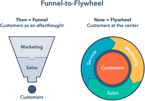
Although your website users are likely online retail shoppers in their spare time, whilst at work they will be looking for different experiences, it is important to recognise some key differences. Firstly, the B2B sales cycle is far longer than a typical B2C [Business to Consumer] cycle. The process of getting another business to buy from you will often rely on multiple interactions, across multiple devices and typically via many channels. The B2B sales funnel (or flywheel if you prefer) needs to be adapted to keep your target customer engaged with you for far longer.

If you want to increase your sales and lead generation performance with a B2B website, you need to consider a range of tactics depending on your service or product and take inspiration from the best.
In this article, we look into some key areas to think about when creating a high-performing and lead generating B2B site.
What is a B2B website? How are they different?
Historically, the term “B2B website” has been used as an excuse not to hold ourselves to the same standards as consumer-focused sites like Netflix, Amazon or ASOS. However, by definition, it can be simply stated that a B2B website is a website developed for selling products or services to business organisations.
A B2B website is focused on communicating a single message to more than one type of buyer. A B2B website can speak to different users (both decision makers and influencers) at different phases of their buying journeys. It needs to deliver value, build trust, generate leads, educate and ultimately, convert.
Fact: Twilio directs its marketing efforts almost solely at developers. There are several articles around this strategy but they recognise the decision often comes from the developer making a recommendation up the chain. There is also typically a greater number of techs and influencers than there are of C-Suite.
Common B2B Website Features
High Value Whitepapers or Industry Reports
According to an agency study of 500 European C-Suite level individuals the upper management and decisions makers in a business are looking for:
- Credible content based demonstrable partnerships
- Content with an owned point of view
- Longer content to provoke in-depth thought
If you want to engage the decision maker with your brand then it’s critical to shift your content production to fewer, higher quality engaging pieces.
Thought Leadership
Personally I value a company having an opinion and owning it. When I look to engage anybody to work with Rixxo I want to know they have a view, will challenge the status quo and can think for themselves on their feet.
This doesn’t mean I’m looking for somebody to do things differently. Just to own what they say and act on what they believe.
Thought leadership can tie nicely into your brand as well. You don’t need to put on a facade to win business and then deliver it a completely different way. It’s ok for you and your business to be “itself” online.
Here are seven key findings of the Edelman-LinkedIn research that appeared in an article on Linkedin.
- Decision makers are reading more thought leadership. This year’s survey found that 58% of respondents read one or more hours of thought leadership per week. That’s eight percentage points higher than last year’s survey.
- More than half of respondents (55%) said they use thought leadership to vet organisations they may hire.
- Thought leadership can create access to high-value decision makers. Almost half (47%) of C-suite executives said they have shared their contact information after reading thought leadership. Ironically, only 39% of sellers said they believe thought leadership helps with lead generation.
- Thought leadership content can generate RFPs. Almost half of decision makers (45%) said they invited a producer of thought leadership content to bid on a project when they had not previously considered the organisation.
- Thought leadership can lead directly to sales. Almost 60% of business decision makers said that thought leadership directly led to their awarding of business to an organisation. Just 26% of sellers believe that thought leadership can lead directly to closed-won deals.
- Thought leadership can create pricing power. More than 60% of C-suite executives said they were more willing to pay a premium to companies that create thought leadership with a clear vision. Of course, only 14% of sellers believe their thought leadership content creates pricing power.
- Thought leadership can also drive growth with existing customers. More than half (55%) of business decision makers said they had increased the business they did with an organisation based on their thought leadership. Similarly, 60% of decision makers said thought leadership convinced them to buy a product or service they were not previously considering.
The stats in these findings really speak for themselves. It is easy as a business owner considering investing in this method to feel wary but if you are being yourself and owning your opinions and ideas then there will be enough people out there who value them to make your business succeed.
Call to Actions
If you are in sales and writing your pitch or script, you will intuitively add calls to actions without even realising it.
“Isn’t it? Don’t you? Won’t that be good?” I always thought of this as the nodding dog technique. You are encouraging a positive response through your selling.
Call to actions don’t just have to be a form to fill in or a newsletter to sign up to. A call to action can be:
- Read more
- Click Here
- Share this page
We can track each of these items and they show us positive reactions to content we are providing. But ultimately you are here for the sale. You must go in for the close!
And if you missed sales training 101, Wolf of Wall Street or my personal favourite Boiler Room then you may be forgetting ABC:
Always be Closing.
Well actually it’s: Always be Calling to Action.
In B2B websites, that means you need to make sure you have some form of call to action at the top of the page, middle and end.
CRM Integration
Once you have your CTA’s in place it’s important to handle that data and make sure you follow up on every lead, and nurture every subscriber.
A quality CRM System can help you do this. There are hundreds of them. I have implemented 4 or 5 different CRMs at Rixxo since we began, starting with the “cheap” option and progressing through to the “it costs us but it really works” option. We use Hubspot (integrated with WordPress) with the Sales, Marketing and Content features to support our growth. Many of our clients use Salesforce, Hubspot or similar CRM marketing systems.
With such a long sales cycle attribution and reporting will be very important. You can be really clever with CRM systems but the simplest approach if you have not got one yet is to get your data into it and start growing your data set.
Data Insight tools
Your B2B website should at an absolute minimum have Google Analytics correctly installed via Google Tag Manager measuring the conversion rate of your Contact Forms. This is a Rixxo staple and we will ensure that all websites we build have this. It’s very hard to make decisions further down the road without this simple measure.
There is a great Google Chrome extension you can install that will tell you if your Analytics and Google Tag containers are set up correctly. You can get Tag Assistant by Google from the Extension Marketplace.
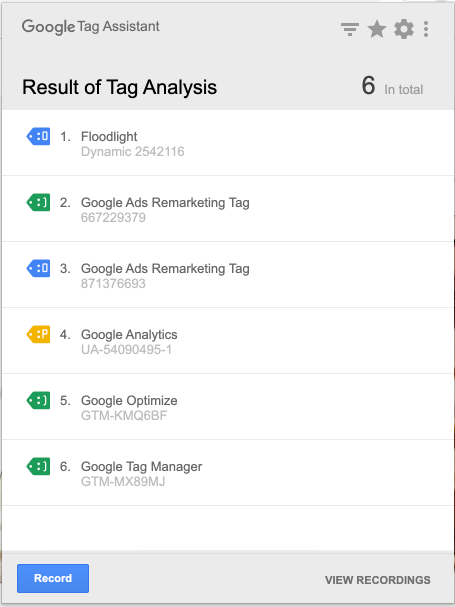

For extra insight into your users, who they are and what they are doing on your site you can add extra tools. These are just a few examples that you can checkout for inspiration.
Making a successful B2B Website. What to consider when creating a B2B website
Keep your brand and message consistent
Importantly, you must not underestimate the power of brand consistency. Ensure that both your visual branding and messaging are clearly and consistently applied across all of your marketing channels, including a B2B website. This strong and consistent branding reinforces your brand’s identity and builds trust.
A new website or website update is not an opportunity to deviate from your brand nor should your brand be defined by the look of your website. Always provide your brand guidelines to whomever is building your website. If you don’t have brand guidelines then start with a simple set via a template. When you do start building and designing consider the atomic design methodology as this will help to keep every page on brand.
Plan and understand a user journey
A business-to-business purchase process is usually more complicated than that of its B2C counterpart. Especially when a purchase is going to be of a high value, it may have multiple stages; form fills, quotes, evaluations of proposals, approval and purchase orders. You never know when your potential customers may be browsing, so designing a user flow that educates a user on the features and benefits of your product or service will encourage them to complete a purchase or enquiry.


Ensuring your forms are easy to complete on all devices and integrated with your CRM will ensure that no one is left without the correct follow up.
Visualising your user journey really helps. This could be a photo of a hand drawing on a whiteboard or drawn with a professional tool such as Figma or Draw.io.
Show some pricing
It can be tough to price products and services on B2B websites, but it is good practice to educate your users on probable costs where possible.
Allow people to generate their own bespoke proposals and make sure any downloads/printables are formatted correctly with your branding.
Check out our hosting and support pages for examples of simple pricing tables
It is often difficult to get pricing on the website if you have complex proposals or an absence of rock-solid pricing. Using guide prices and talking about budgets in your content can also help to anchor clients on costs and give an insight into your value.
Use these basics of Neuromarketing
Emotion is the main trigger for any purchase whether B2B or B2C. Whilst your branding is key in driving emotion there are a number of other steps you can take. Here are three simple neuromarketing tips:


1. Social Proof – display testimonials and reviews. They reinforce your claims and build trust throughout the customer journey.
2. Paradox of Choice – make it clear and easy for users to flow through your B2B website. Giving users too much choice can overwhelm and drive them away before they find what they were looking for.
3. Mirror Neurons – show photos or real people in your business with expressions that you want your customers to feel. Users will be more likely to associate these feelings with your business.
Remember, B2B buyers are more risk averse. They often fear changing or taking on new suppliers because of concerns of leaving their professional reputation or bank balance in a worse state than when they began the process. One negative experience can ruin your reputation and cost you a sale.
Build it for your buyer’s colleagues too
Remember it may not be just one person from a company who visits your B2B eCommerce website before they buy from you. Procurement, managers, accounting and legal teams could all be directed to your site, so make sure that the information they’ll want to find out is accessible. Your homepage should act as a roundabout for users and an advanced site search tool will avoid anything being missed.
The important elements of a successful B2B website
As we have covered so far, effective planning of the site should be coupled with a range of tactics when building a B2B website, but we are yet to discuss some of the other elements that the best B2B websites have.
Lots of valuable content
Although the design of your site will help build credibility and prime the customer to the type of experience your business will offer, it is still less important than your site content. Your website needs to position your business as a knowledgeable source that is capable of delivering. Without content, B2B websites have no way of retaining their prospects. You should focus first on writing the best content to deliver your message and design pages around it. Keeping your clients informed throughout will help deliver more sales and enquiries in the long run.
Be sure to offer a wide array of content in multiple formats such as videos, white-papers, blogs, guides, FAQs and webinars to help users understand your proposition.
Include lots of call-to-actions (CTAs)
It is important to offer a range of CTAs throughout your B2B website to guide people through the user journeys you have mapped out. If you are able to use a simple message to generate a form submission, opt in, call, email or live chat enquiry, then you’ll be far more likely to be able to follow up that enquiry and understand their needs. Where you can use wording in your buttons that resonate with what your visitor is seeking.
Speak with us and you will understand why our clients trust us beyond being just an agency
We grow businesses pragmatically and with the utmost respect for budgets. We treat our clients businesses and budgets as if they were our own. Find out for yourself...
Speed up your website page load time
Time is money! Make sure your site and its page load times are under 3 seconds (ideally 1 – 2 seconds). The probability of a user leaving before the page loads (a bounce) increases by 32% when a site takes over 3 seconds to load. It will also negatively impact your organic search rankings… aka SEO.
Search Engine Optimisation (B2B SEO)
The best performing B2B websites drive visits and leads from organic search. When a site is built well, fast to load, has well written content and the SEO basics covered, it will typically perform well. It’s important to know “a crowd attracts a crowd” online too. Take every opportunity to direct traffic through your site. Direct extra traffic with email marketing, posting content to social media, customer portals and internal portals.
Before you begin taking more advanced (and costly) steps, ensure you have the basics in place and a goal in mind. Rarely just paying a small package fee to a 3rd party will generate the results you actually want.
Build your site to be detected as mobile optimised
Although we have stated that design plays second fiddle to having great content on a B2B website, it’s important it is not overlooked. The way your website looks is seen as a direct representation of the quality of service your customers can expect to receive. If you don’t have data to educate your decisions, keep your site simple, clean and consistent, whilst not forgetting to embrace the basics of website accessibility best practices.
As early as 2012, we decided that we wouldn’t build any website that wasn’t responsive. Since then, mobile traffic has overtaken desktop and tablet, making up 52% of all website traffic. B2B websites may argue that their primary users will be on their desktops or laptops, but this is often not the case during their research phase or first interaction with your business.
We recommend designing lead generation pages mobile first and consider taking this approach for all the other tools you may offer.
There are some techniques you can use to help search engines see your site as mobile first and work brilliantly on desktop. It’s important to deal with site design sensibly and realistically in a way that is based on practical rather than theoretical optimisation techniques. You won’t see any benefit of going mobile first if you are 96% desktop usage and neglect the desktop experience. At the same time you want to increase traffic and leads, so it can get confusing!
Our best advice here is to build the site for the customer and make it great for them. Then add in the snippets and bits you need to pass mobile testing. Once you are at that point you can use the new data you have gathered to improve and iterate over time.
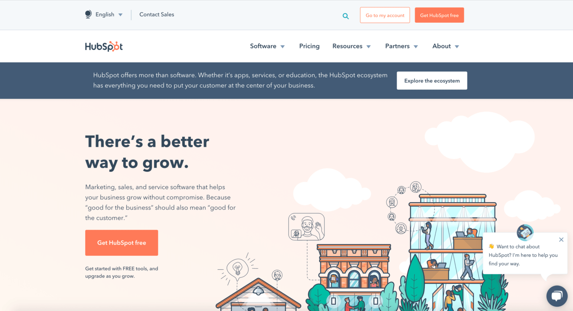

Hubspot
As you may expect, Hubspot has rapidly grown to be a market leading CRM and marketing automation tool. Its site is full of a range of content, both free and premium, including courses, buyers guides and customisable pricing tables. It has numerous funnels, call to actions and make several opportunities to speak with a sales team to help you make a decision.
NetConsulting
NetConsulting is one of ours. We think it’s a great example of how all of the elements of this article have been pulled together to create an easy to manage website that generates leads.
Click here to read a more in-depth case study of this project.


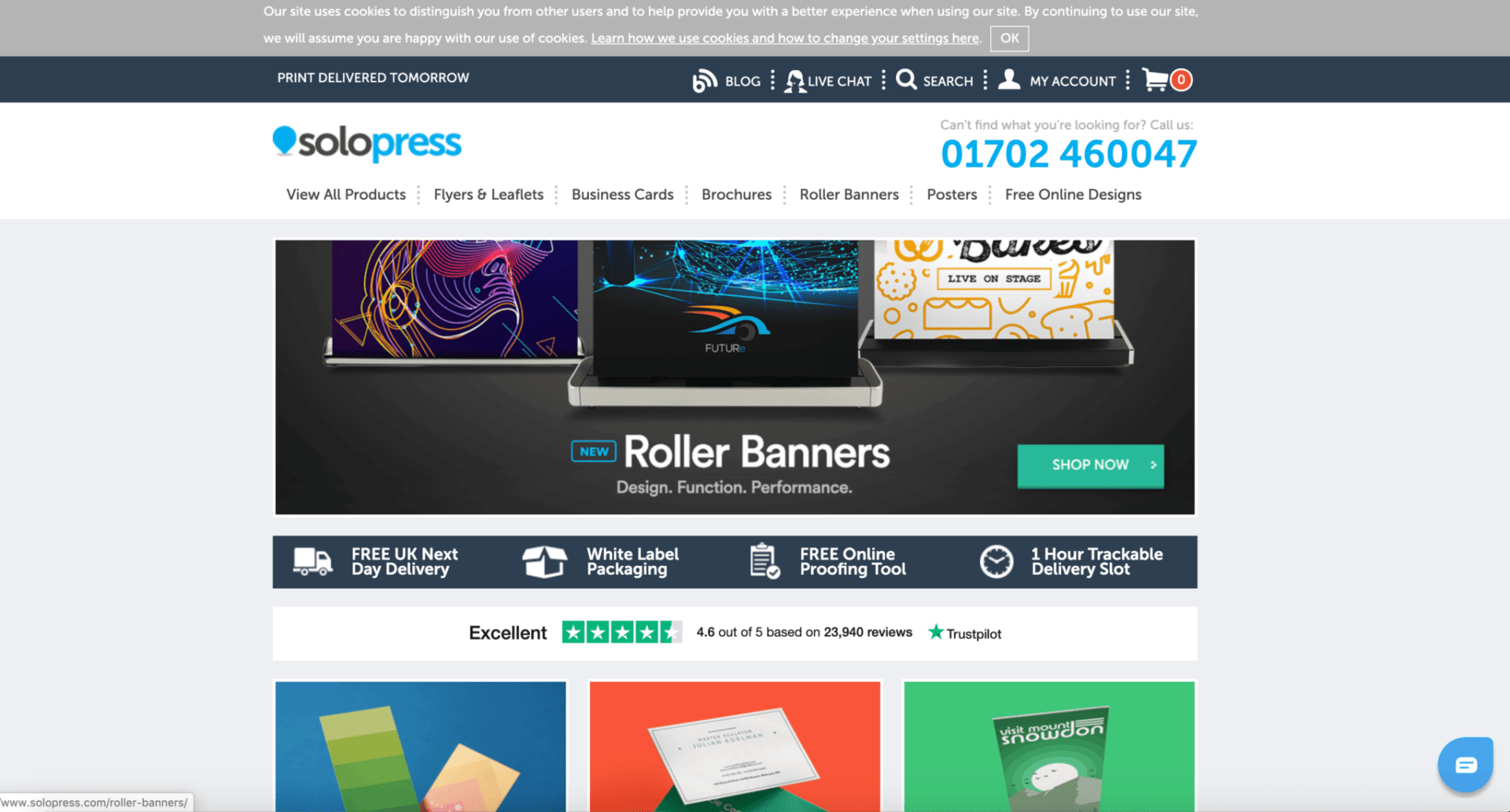

Solopress
Solopress is our favourite online printing store and a great B2B eCommerce store example. It makes an often complicated process very easy and is packed full of information on its products and services. They have clear messaging around “Free Delivery” / “Next Day Delivery” throughout the site and the checkout process is quick to get through.
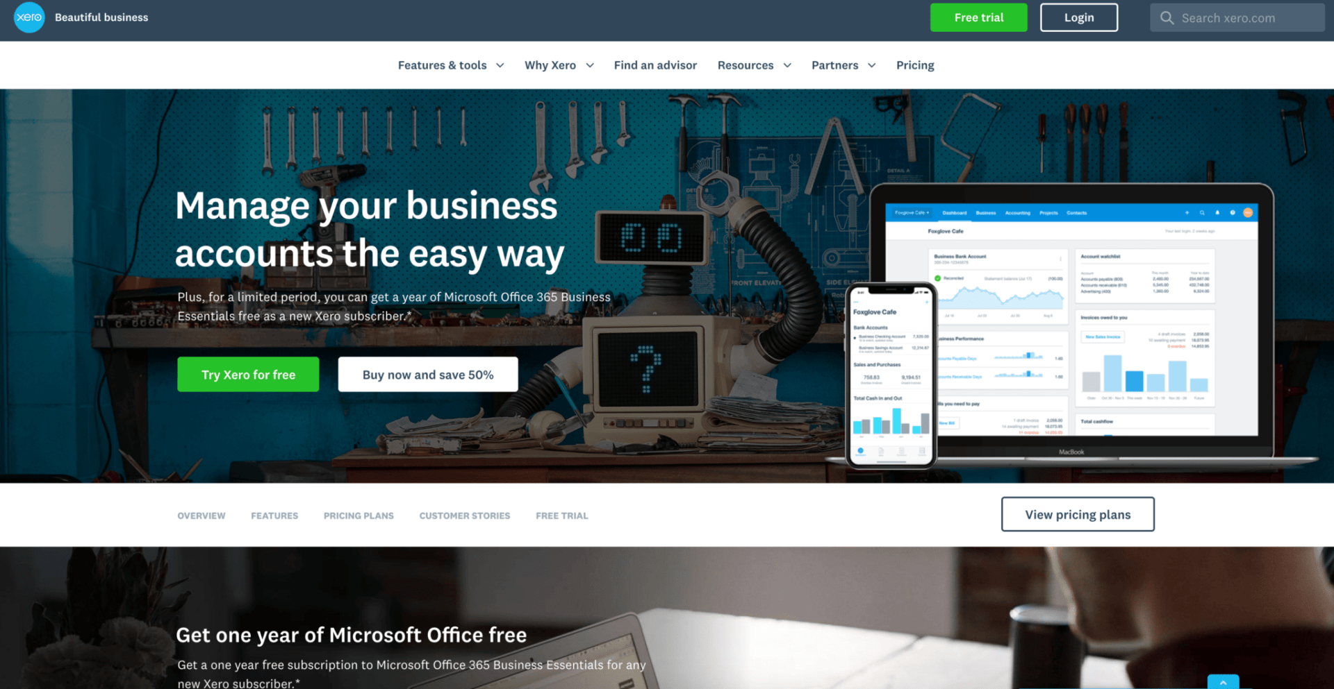
Xero
Another B2B website we think is great is that of accounting software XERO. It makes its proposition clear by segmenting site users at an early stage and has a number of incentives including free gifts and free trials. The site is perfectly orientated to its target market and they understand how to increase the chance of signing up a new user.

Conclusion
Business-to-Business and Business-to-Consumer are dying terms. If we look critically at this article there isn’t really much different about a B2B Website and a retail or B2C site. We are all humans after all. We should however recognise there are different priorities and considerations. Users are less impulsive and more risk averse, they will probably “shop” more on a desktop whilst at their desk during office hours. In a B2B website we aim for leads rather than purchases and we have more opportunities to lose a lead than generate another.
Would you like to generate more leads from your existing B2B website? Would you like to build a new one that is easy to manage and grow? Please get in touch with us below and find out how a Rixxo B2B website will generate leads and grow your business.
Looking to connect with a B2B specialist agency?
Check out DesignRush: A marketplace to find top agencies, including Rixxo!
